
Premium chocolate brands often assume that ingredient quality alone defines luxury. However, many high-priced chocolate gifts still fail to create a strong emotional impact. The reason is rarely the chocolate itself—it is the packaging. In luxury gifting, perception forms before taste, and packaging silently determines whether a gift feels prestigious or disposable.
This article explores why even the finest chocolate can feel “cheap” in the eyes of recipients. More importantly, it explains how thoughtful material choices, tactile contrast, and Mother of Pearl inlay can dramatically elevate perceived value. For brands involved in bespoke corporate gifting or high-end confectionery, understanding these principles is essential for building lasting brand impressions.
Contents
- 1. The Plastic Trap: When Synthetic Materials Undermine Luxury?
- 2. Flat Surfaces, Flat Impact: The Problem with Textureless Packaging
- 3. Generic Branding Fatigue: When Gold Foiling Stops Feeling Special?
- 4. Disposable Thinking: Why One-Time Packaging Cheapens the Gift?
- 5. The Weight Signal: How Physical Substance Shapes Perceived Value?
1. The Plastic Trap: When Synthetic Materials Undermine Luxury?
Premium Chocolate Packaging Design frequently fails at the first visual and tactile interaction because of an over-reliance on plastic components. Even when chocolate is sourced from rare cacao origins and crafted by master chocolatiers, glossy plastic trays or shrink-wrap films immediately signal mass production. Plastic communicates efficiency, cost optimization, and disposability—values that contradict luxury positioning.
Luxury gifting relies on sensory cues that imply intention and permanence. Synthetic materials, regardless of their finish, lack emotional weight. They feel light, sound hollow, and visually reflect industrial processes rather than craftsmanship. As a result, the recipient subconsciously categorizes the gift as transactional instead of meaningful.
Replacing plastic with natural materials changes this perception instantly. Wooden trays, shell-based accessories, or Mother of Pearl inlay elements introduce organic irregularity and tactile authenticity. These materials age gracefully, carry natural weight, and feel deliberate. In premium gifting packaging, this shift from artificial to natural materials transforms the gift into an object of value rather than a temporary container.
For brands focused on sustainable luxury materials, this transition also reinforces ethical narratives. Natural materials communicate responsibility and long-term thinking, which increasingly influence purchasing decisions in high-end corporate gifting and international markets.
2. Flat Surfaces, Flat Impact: The Problem with Textureless Packaging
Luxury chocolate packaging often relies heavily on flat paper boxes enhanced by gold foiling or embossed printing. While these techniques appear premium at first glance, they lack visual depth. Without texture contrast, packaging feels visually monotonous and easily replicable, which weakens its exclusivity.
Flat surfaces provide limited sensory engagement. The eye scans them quickly, and the hand finds nothing memorable to explore. In high-end gifting mistakes, this lack of tactile and visual layering is common. Recipients may admire the box briefly, but the experience ends almost immediately.
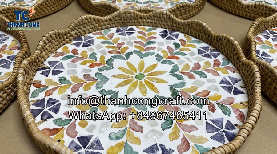
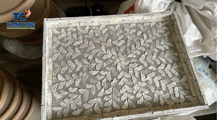
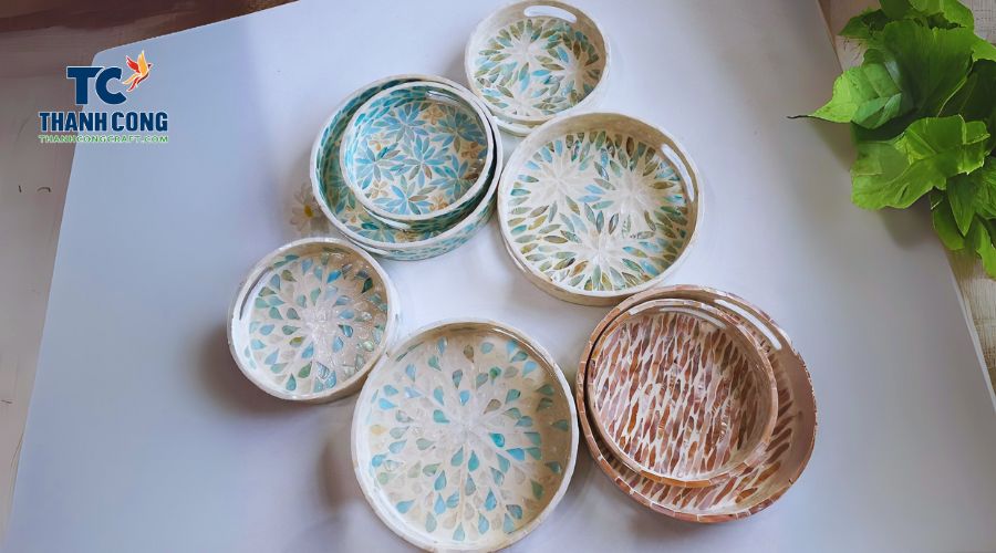
Introducing material contrast restores visual hierarchy and engagement. When Mother of Pearl inlay is integrated into wood, lacquer, or thick paperboard surfaces, it creates a dynamic interplay between matte and iridescent finishes. This contrast adds dimensionality, encouraging the eye to linger and the hand to explore.
Texture variation also reinforces craftsmanship. Irregular nacre patterns, natural grain variations, and subtle imperfections signal handmade value. In premium chocolate packaging design, these cues differentiate bespoke products from mass-produced alternatives, elevating the overall gifting experience without altering the chocolate itself.
View details: Why Are Decorative Trays More Than a Display Surface for Gifting?

3. Generic Branding Fatigue: When Gold Foiling Stops Feeling Special?
In luxury gifting, branding should feel intentional and rare. However, many premium chocolate brands still rely on standard gold foiling for logos and decorative elements. While gold foil once symbolized prestige, it has become overly familiar. Today, it appears on everything from mass-market cosmetics to promotional gift boxes, which significantly weakens its impact.
When recipients see gold foiling, they no longer pause to admire it. Instead, they subconsciously categorize it as predictable and easily replicated. This creates a disconnect between the price of the chocolate and the emotional response to the packaging. The gift may look “nice,” but it does not feel exclusive. In high-end gifting mistakes, this overuse of conventional luxury cues is one of the most common issues.
Mother of Pearl inlay offers a fundamentally different branding language. Unlike printed or stamped finishes, nacre is a natural material with unique patterns that cannot be duplicated. When a logo or brand mark is crafted using shell inlay, it becomes part of the object rather than a surface decoration. This transforms branding from a visual signal into a material statement.
For bespoke corporate gifting, this distinction matters deeply. Decision-makers want gifts that reflect thoughtfulness and originality, not templates. A brand identity expressed through Mother of Pearl inlay communicates craftsmanship, patience, and artistic intent. As a result, the brand is remembered not just for the chocolate, but for the experience of receiving something genuinely rare.
4. Disposable Thinking: Why One-Time Packaging Cheapens the Gift?
One of the biggest reasons chocolate gifts feel cheap is their short lifespan. Once the chocolate is eaten, the box is often thrown away. This disposability signals that the gift was meant for consumption only, not appreciation. In luxury psychology, items designed for one-time use rarely feel valuable.
When packaging lacks secondary purpose, it fails to build emotional attachment. Recipients enjoy the chocolate, but the experience ends quickly. Over time, the memory of the gift fades, and so does the brand behind it. This is especially problematic in corporate gifting, where the goal is long-term relationship building rather than momentary delight.
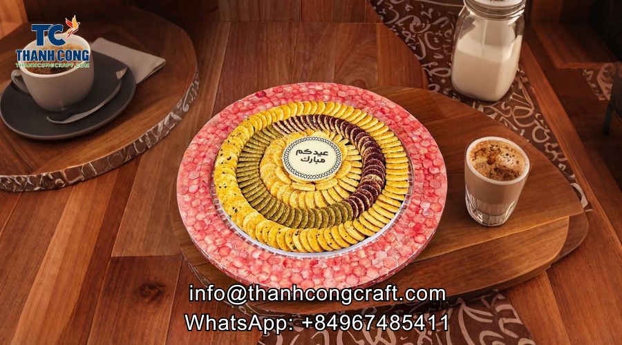
Designing packaging with a keepsake mindset changes the entire equation. When chocolate boxes are constructed like jewelry cases or decorative trays, they gain life beyond the product inside. Mother of Pearl inlay enhances this transformation by adding ornamental and functional value. The box itself becomes an object worth keeping.
As a result, the packaging remains in the recipient’s environment—on a desk, shelf, or dresser. Each time it is used or seen, it reinforces brand presence. This approach turns premium chocolate packaging design into an investment rather than an expense, extending perceived value far beyond the original gifting moment.
Find out more: Can Artificial Lighting Cause Mother of Pearl Inlay to Fade?
5. The Weight Signal: How Physical Substance Shapes Perceived Value?
Weight plays a surprisingly powerful role in how luxury is perceived. Studies in consumer psychology consistently show that heavier objects are associated with higher quality and durability. In contrast, lightweight packaging often feels fragile and temporary, regardless of how refined it looks.
Many chocolate brands prioritize lightweight materials to reduce shipping costs. While practical, this choice sends an unintended message. When a recipient lifts a box and feels almost no resistance, the brain immediately lowers its value assessment. The chocolate inside may be exceptional, but the physical experience contradicts that expectation.
Introducing natural materials adds subtle but meaningful weight. Elements such as wooden bases, shell inlays, or Mother of Pearl accessories create a sense of density and permanence. This added heft does not need to be dramatic. Even small increases in weight can significantly alter perception.
In premium chocolate packaging design, weight acts as a silent confirmation of quality. It reassures the recipient that what they are holding is substantial and thoughtfully made. Combined with tactile richness and visual depth, physical weight completes the luxury experience, aligning the gift’s feel with its price point.
Learn about: Mother of Pearl Colors: Explore Nature’s Stunning Shades
Reach out to us today to learn more about our products or to place a wholesale order. We look forward to connecting with you!
- Thanh Cong Handicraft Co., Ltd
- Email: [email protected]
- Tel/WhatsApp: +84967485411
Explore our Products Collection for more choices! Contact Us!
