
Luxury Chocolate Presentation is not judged when the chocolate is tasted. It is judged much earlier—often before the box is even opened. In premium gifting scenarios, especially corporate gifting, hospitality gifting, and luxury retail, recipients subconsciously decide how valuable a chocolate gift is within the first three seconds of seeing and touching it.
These first three seconds form what marketers call the “instant value frame.” During this brief window, the brain processes visual cues, tactile feedback, and material symbolism to answer one silent question: Is this gift ordinary, or is it special? Once that judgment is made, it becomes very difficult to reverse, regardless of how good the chocolate itself may be.
This article breaks down the “First 3 Seconds Rule” in luxury chocolate presentation and explains how Mother of Pearl packaging accents can be used strategically to win attention, establish prestige, and elevate perceived value at every critical moment of the gifting experience.
Contents
- 1. The Visual Hook: Leveraging the Iridescence of Mother of Pearl
- 2. Tactile Luxury: The Instant Connection of Natural Texture
- 3. The Heirloom Signal: Establishing Prestige Without Words
- 4. Color Psychology: Using Nacre Shades to Enhance Appetite Appeal
- 5. The Ritual of Discovery: Designing an Unforgettable Opening Sequence
1. The Visual Hook: Leveraging the Iridescence of Mother of Pearl
Luxury Chocolate Presentation begins with visual dominance, because the human eye reacts to light and contrast faster than it reads logos or understands branding messages. In the first second, attention is not logical—it is instinctive. The eye scans for elements that appear dynamic, layered, or visually “alive.”
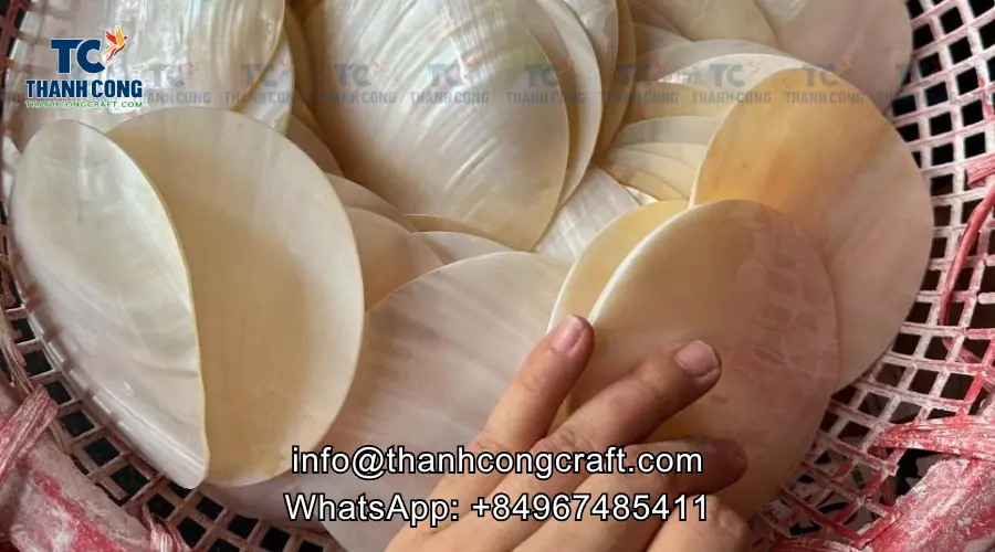
Mother of Pearl packaging accents create this effect through iridescence, a natural phenomenon where light reflects in shifting colors depending on viewing angle. Unlike metallic inks or gold foil, which reflect light in a flat and predictable way, nacre produces depth and movement. This makes the packaging feel visually active, even when it is sitting still on a table or shelf.
For chocolate brands, this matters because gifting environments are visually crowded. Premium ribbons, matte finishes, and embossed logos are now standard. Iridescence allows a gift to stand out quietly, without looking flashy or overdesigned. It creates a visual hook that holds attention longer, giving the product an immediate advantage in visual marketing for confectionery.
Experience the details:What Must Chocolate Brands Consider When Changing Displays?
2. Tactile Luxury: The Instant Connection of Natural Texture
Luxury Chocolate Presentation moves into its second second through touch, and this moment is often underestimated. The instant a recipient picks up the box, their hands assess weight, temperature, and texture before their eyes even finish processing the design.
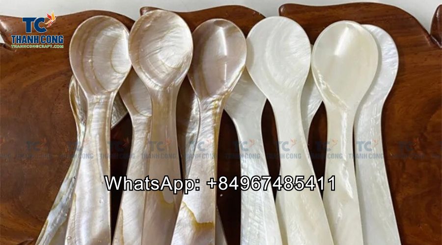
Mother of Pearl delivers a tactile experience that feels undeniably premium. Its surface is naturally smooth, cool, and solid, communicating durability and craftsmanship. This sensation is fundamentally different from laminated cardboard, plastic coatings, or synthetic finishes that may look premium but feel light or artificial.
When combined with materials like wood or lacquer, Mother of Pearl creates contrast that enhances sensory perception. The warmth and grain of wood paired with the cool polish of nacre creates a tactile dialogue that feels intentional. This physical confirmation reinforces trust, assuring the recipient that the value they perceived visually is real and tangible, which is essential for a premium unboxing experience.
3. The Heirloom Signal: Establishing Prestige Without Words
Luxury Chocolate Presentation reaches its emotional turning point in the third second, when the brain assigns meaning and long-term value. At this stage, materials matter more than design complexity, because they carry cultural and emotional associations.
Mother of Pearl has been historically associated with jewelry, fine décor, ceremonial objects, and heirloom pieces. Its presence signals longevity, care, and craftsmanship rather than mass production. When used in chocolate packaging, it subtly reframes the gift from something meant to be consumed quickly into something meant to be appreciated and remembered.
This heirloom signal has a powerful effect on perceived value. Without changing the chocolate itself, the packaging alone can elevate the gift in the recipient’s mind. A chocolate gift that might otherwise feel like a $50 item can easily be perceived as a $150 gift because it feels intentional, collectible, and emotionally weighted. In corporate gifting, this silent prestige is often more impactful than overt luxury branding.
Related post: Is Mother of Pearl Suitable for Chocolate and Dates Presentation?
4. Color Psychology: Using Nacre Shades to Enhance Appetite Appeal
Luxury Chocolate Presentation must stimulate appetite as well as admiration, and color plays a central role in shaping that response. Chocolate relies on rich, deep browns to signal indulgence, quality, and flavor intensity.
Mother of Pearl complements chocolate visually because its tones are soft rather than aggressive. Whites, silvers, and subtle blue-green hues enhance the richness of chocolate without overpowering it. This balance creates a harmonious color relationship that feels refined and premium.
Unlike gold or bold metallics, which can distract from the product itself, nacre reflects surrounding colors gently. This makes chocolate appear more inviting and more expensive at the same time. For brands focused on first impression in gifting, this subtle enhancement increases appetite appeal while maintaining high-end brand perception.
5. The Ritual of Discovery: Designing an Unforgettable Opening Sequence
Luxury Chocolate Presentation succeeds when opening the box feels like a ritual rather than a mechanical action. The final stage of the first three seconds is about anticipation and reward.
Strategically placed Mother of Pearl elements—such as clasps, inlays, or inner lid details—guide the recipient’s attention as the box opens. The gentle shimmer revealed inside acts as a visual reward, reinforcing the sense that the gift has been carefully designed, not simply packaged.
This ritual extends the experience beyond consumption. After the chocolate is gone, the box often remains as a keepsake, storage piece, or decorative object. This extended lifecycle transforms the gift into a lasting brand touchpoint, ensuring the premium unboxing experience continues long after the chocolate itself is enjoyed.
Read next: Why Do Some Materials Feel Premium While Others Don’t?
Reach out to us today to learn more about our products or to place a wholesale order. We look forward to connecting with you!
- Thanh Cong Handicraft Co., Ltd
- Email: [email protected]
- Tel/WhatsApp: +84967485411
Explore our Products Collection for more choices! Contact Us!
